As an Introductory offer, I’m offering 70% off Kamado over on Fontspring.
Don’t miss out! … https://www.fontspring.com/fonts/hashtag-type/kamado

Don’t miss out! … https://www.fontspring.com/fonts/hashtag-type/kamado

I’m excited to announce that Kamado is finally here!

Kamado began its journey as an experimental typeface with a cultural essence. Influenced by type around the globe during my studies. The result… a plausible and exciting typeface!
The rhythm of each letter is fundamental to the design, each exploring and exaggerating the way it can be drawn with continuous strokes… full of character.
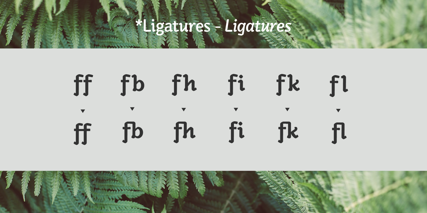
Kamado has a very distinctive look, which would give a clear awareness of a brand. Kamado works great in many type settings. Its variety of weights provides a range of choices that will help you find the best typographic effect for your project. Details include twelve weights including italics, over 470 characters, manually edited kerning, ligatures and case-sensitive punctuation.


Kamado is now available from Fontspring… https://www.fontspring.com/fonts/hashtag-type/kamado
Check out the full presentation over on Behance… https://www.behance.net/gallery/69062209/Kamado-Typeface
I thought I would add some images of the most recent typeface I am working on, taken from my Instagram account. This typeface will be great for display with quirky 'knot' features, which emphasise the pen direction. I am currently doing the italics as this style works perfectly in the italic version!
If you would like to keep up to date with updates on my work and what I do as a designer then follow instagram.com/hashtagtype
I have recently done the branding for Heritage Resin Surfaces, which was such an exciting project. The subsidiary part of Heritage Developments Ltd, the brand had to be adaptable to the other sides of the company in the future.
I have created a clear logo using a serif typeface to make the company seem more professional and adding an established mark to the logo. This is because the company wanted to emphasise the quality of the product, the professional service they offer and the time they have put into the business.
The budge allowed for some beautiful features such as a lovely paper stock and gold foil printing on the marketing material which I think looks amazing and defiantly stands out a mile! It defiantly says quality!
Here are some pictures... I'm hoping there will be a future brochure to design!

So I have finally decided to start learning code... It's about time after all.
Code is something I have always wanted to know about and envy the people who do know how to code. It's something that can be implemented in to so much these days with most things having a web presence, and its only going to be more common as time goes on, but I was always under the impression that it was way too complicated.
I started with learning HTML and CSS through Codecademy to get to grips with the basics which I have now completed and everything all of a sudden seams more easy and inviting. I now know a lot of basics and how to structure documents with HTML and CSS and when I look at some code it doesn't look alien to me any more! I know that there's a long way to go yet and this is just the beginning but I have learned so much already and I have enjoyed the learning process, I can't wait to see what's next, it's become a hobby to learn how to code!
I am trying to find as many resources as possible at the moment to develop my skills in HTML and CSS further and put it to practice as I think the hardest thing will be remembering everything! I will also be going back to Codecademy to learn other languages such as PHP and Java Script in time then again practising with my new skills.
The big idea is if I can better understand how web developers work and the content that they require, then in turn I can become a better graphic designer and design better fitting content for them!

I'm really excited to announce that Rosina has made it into the Best Sellers list over at My Fonts! Currently at Number 41 but climbing everyday!
This is the first time one of my typefaces have been in this list so I am very Happy! The sale runs out this Sunday if anyone would like to grab a bargain then here is the link > myfonts.com/fonts/northernblock/rosina/
Rosina is 80% off for a limited time only as an introductory offer! Don't miss out.
You can buy Rosina from: The Northern Block, MyFonts, Fontspring and YouWorkForThem!
Geometric typefaces are widely used across display advertisements, branding and signage, my aim for my latest typeface Rosina was to create a typeface ideal in these scenarios without the need for further manipulation. I wanted to create something that stands out and becomes a real crowd pleaser all on its own!
Rosina has taken geometric forms and transformed them into a sturdy typeface, with optical adjustments to get a refined look. The initial inspiration came from a lot of the hand drawn typefaces I saw across social media, but it soon developed into a style that regardless of national origin is noticeable as Art Deco with a look that embodies the future.
I took the typeface down a root influenced by the confidence, vigour and optimism of Art Deco architecture apparent in the Roaring Twenties. I strived to simulate the period style through the use of tall ascenders and descenders, giving it a very vertical appearance, much like the Art Deco buildings. The Chrysler Building is a classic example of this essence.
To make Rosina more versatile, form always follows function; it has a lot 21st Century sensibility (not quite as crazy as some of the Art Deco typefaces out there!) Another thing to note is that a lot of typefaces that are influenced by this period style are uppercase only, Rosina has both – a lovely set of lowercase and uppercase that compliment each other wonderfully.
Rosina explores typographic boundaries with its playful appearance (but when you know the rules you are able to break them!)


Full details include 6 weights from Thin to UltraBold and includes a range of OpenType features such as case sensitive punctuation.